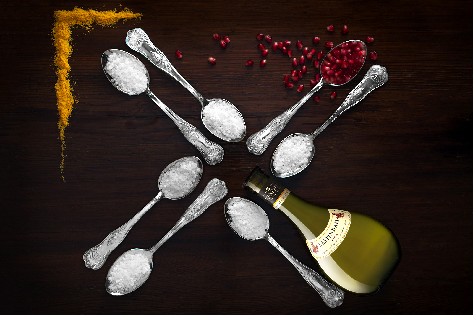
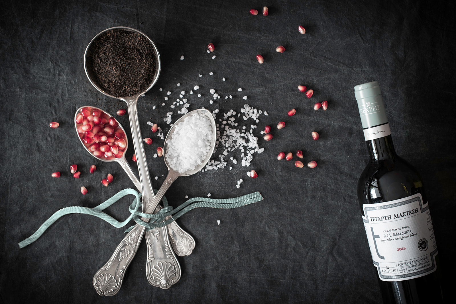
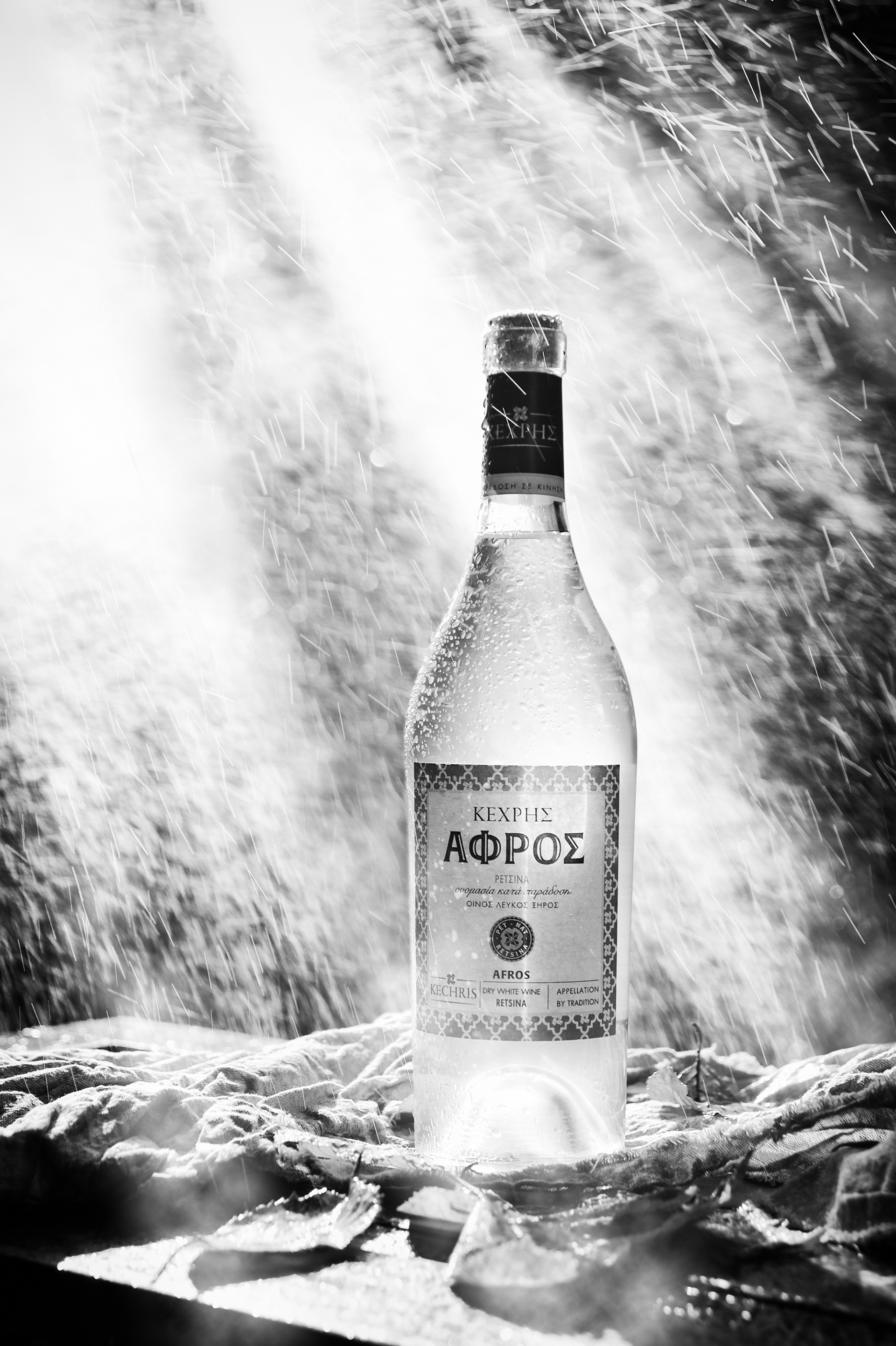

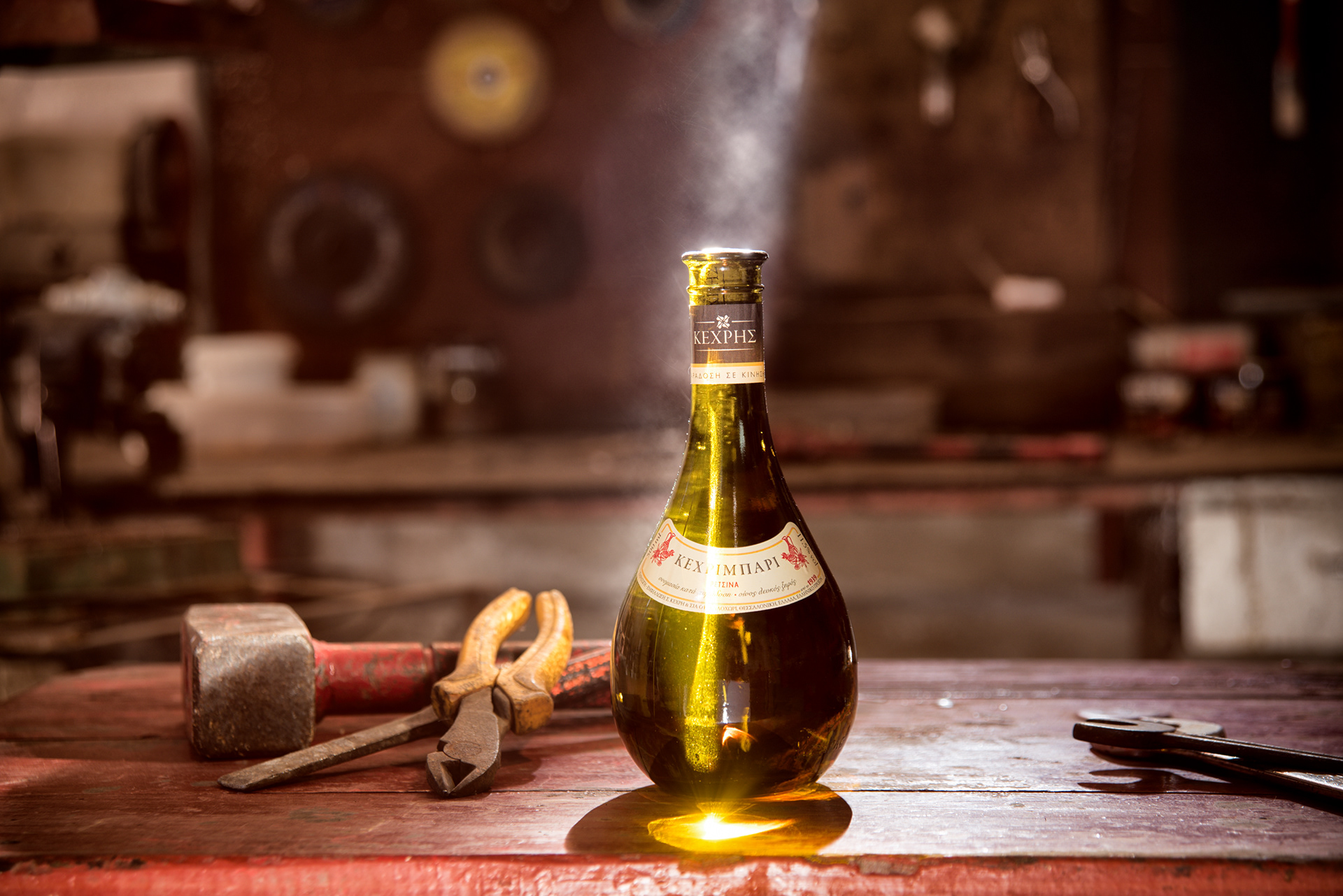
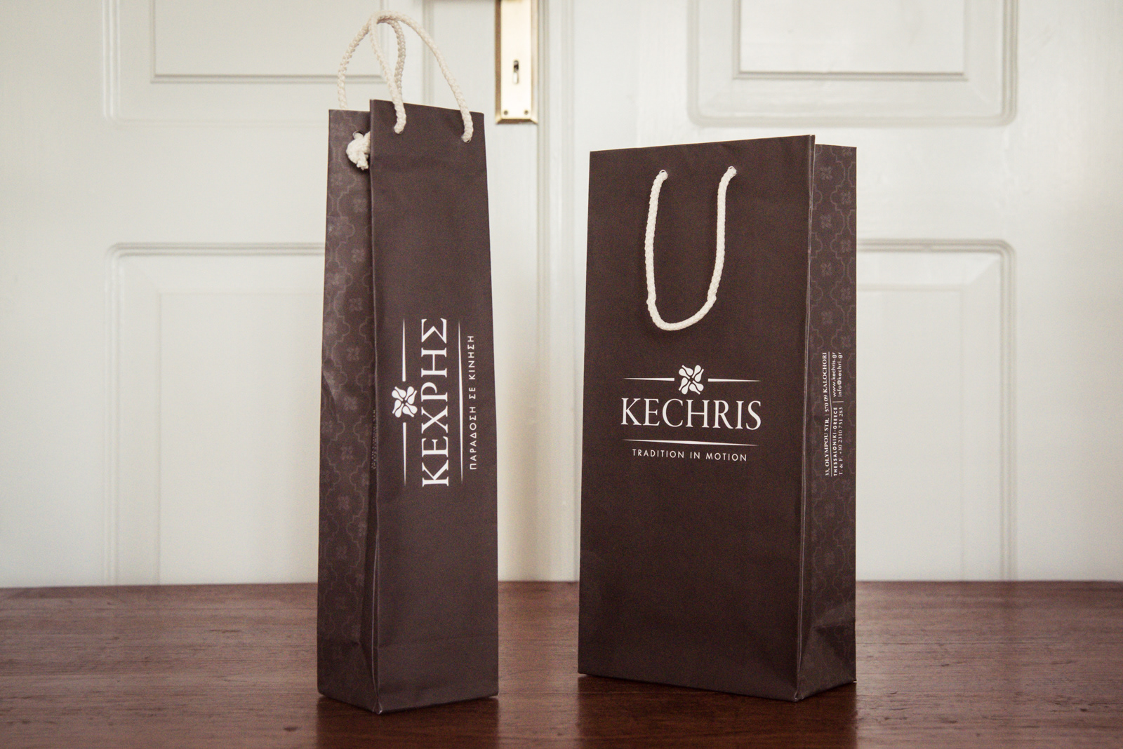
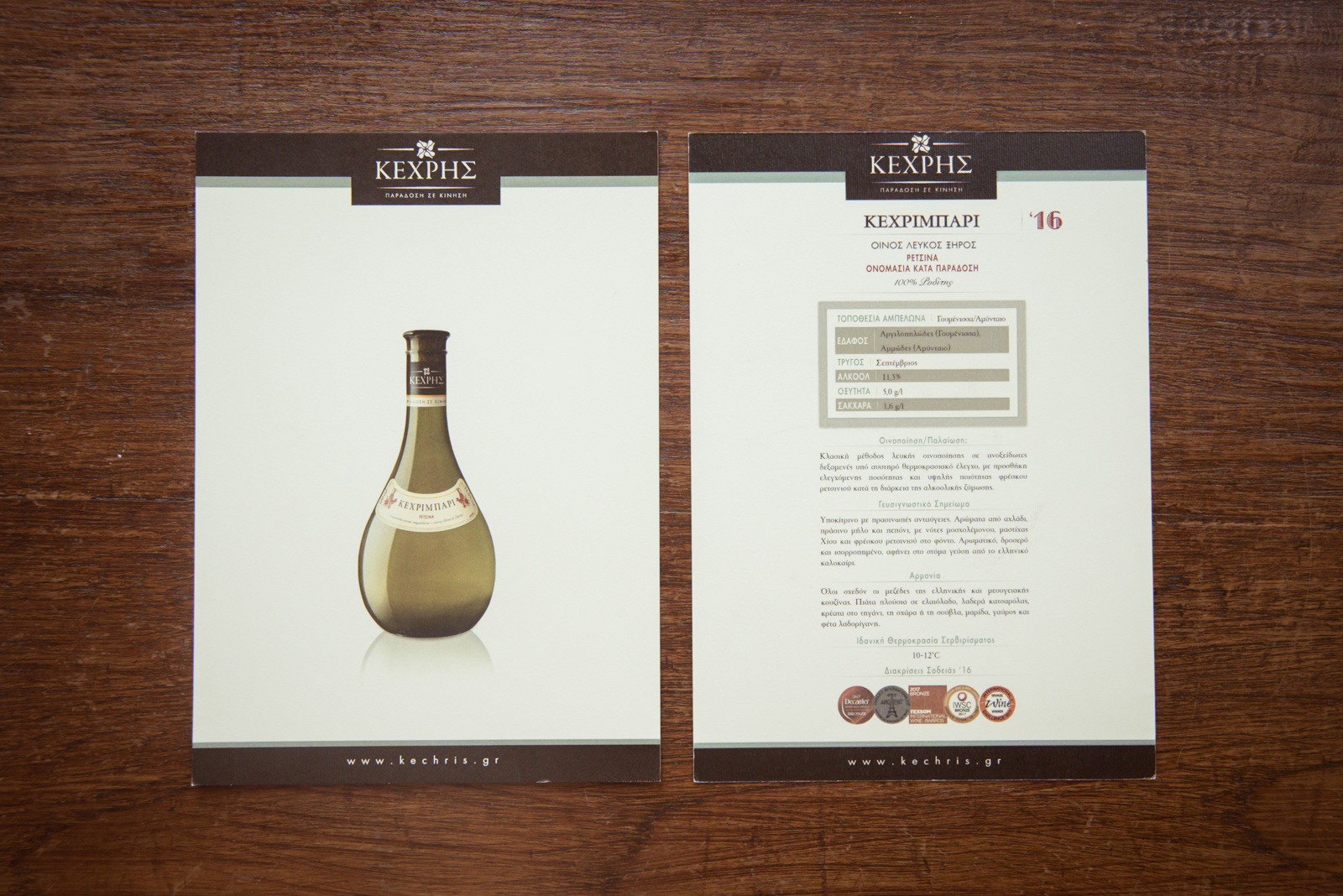
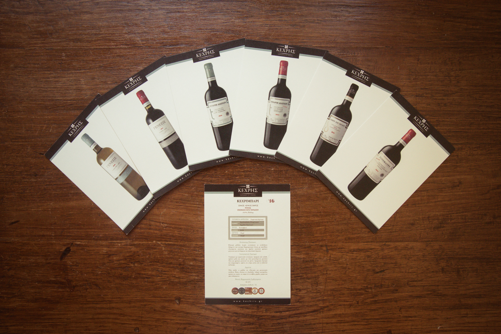
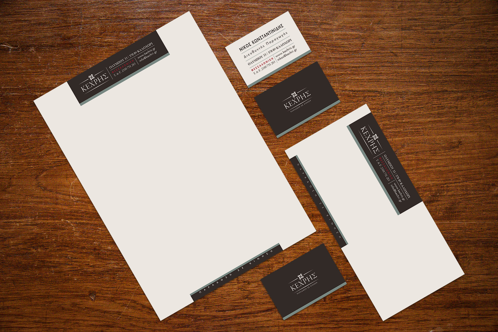
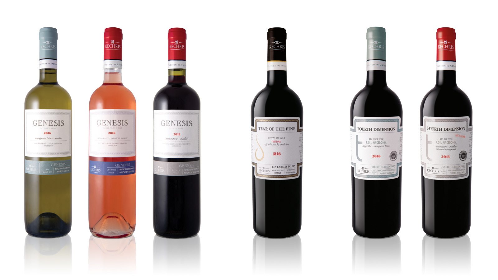

After many years of building the image of Kechris winery which had gained visibility and recognition we decided to change the look of the brand to reflect its long history, its quality, authenticity and innovation. Its name is the name of a visionary, a wine maker well known for his authenticity, his quality products and especially the fact that he and his family achieved to get retsina wine among top wines worldwide, to make it gain the place it always deserved to have in peoples minds. Thus, we could not have written the name with anything less than a timeless, classic and “classy” font such as Garamond. And could not think of a better symbol than that of the famous bottle shape of its well known retsina wine “Kechribari”. Placing the bottle in a way to create movement in order to transmit the “tradition in motion” tagline. All brand elements, classic and modern, serious and freehand typeface combinations, vintage colors, imagery and materials, get together in all design elements to create a vintage-classy look and reflect the winery’s values, its multidimensional character, its uniqueness.